Casino Design Psychology: Planned to Spend
Everyone knows of the word casino, but few realise it derives from the Italian casa, meaning house. During the 19th century, this term encompassed a wide range of public buildings that offered pleasurable activities. Things like live entertainment, dancing, and gambling. In modern Italy, the word gets applied mainly to brothels, with casinò, with an accent, getting reserved for gambling halls.
These locales in the form we know them now appeared in the US in the late 19th century. The Newport Casino in Rhode Island was one of the first examples of an establishment constructed exclusively for games of chance, somewhere between 1879 and 1881. Yet, this sector, US-wise, did not start to bloom until the mid-20th century.
During the 1960s, America’s business tycoons sought to take advantage of Nevada’s gambling laws by building hotel-casino properties throughout the state. As the number of these venues grew, so did the number of tourists. Therefore, operators had to forge strategies concerning how to keep players active on their floors engaged in betting activities.
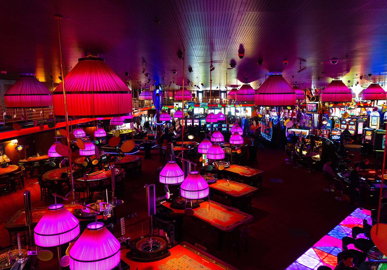
That started with the way they architecturally planned their gambling areas that get dominated by reel-spinning games. These products do not differ dramatically compared to online slot designs.

Photo, Michal Dolnik.
Floors Designed to Disorient
Bill Friedman is a former professor of casino management at the University of Nevada Las Vegas and the president of the Friedman Management Group. The firm specialises in casino design psychology, management, operations, and marketing problems for the hospitality industry.
Friedman is also the author of the book Designing Casinos to Dominate the Competition, released in 2000. In it, he pours years of research into pinpointing specific design principles gambling operators implement to keep gamblers on their floors for extended periods.
It all starts with constructing a labyrinth-like structure that can easily disorient visitors. Science shows that smaller winding passages make people want to explore more, while vast areas reduce the line of vision, confusing people regarding where to move to next.
Due to architectural limitations, casinos have to get creative and design walkways with their gaming products. If a player has to take a long route littered with exciting gaming opportunities at each step, he is more likely to try and take advantage of one or locate a machine that catches his eye.
Mazes always have a priority over straight aisles. So, sharp turns every couple of dozen feet or so have preference over long corridors. Also, low ceilings beat high ones. As mentioned, the goal is to make players feel like they have gotten confined to an area riddled with gambling possibilities.

Photo, Tobias Smietana.
The Playground Approach
However, while many believe that the concepts Friedman outlined hold water, and have proven successful, Las Vegas-born designer Roger Thomas rebukes many of Friedman’s theories.
Thomas’s way of thinking involves what he calls a playground approach. This casino design psychology incorporates high ceilings, glamorous expansive lobbies, and luxurious décor. His strategy is not to disorient visitors and bombarding them with choices but to make them feel like they are a part of something grand.
The idea behind his designs is that being surrounded by opulence can encourage players to engage in risky spending, and the lavish setting may act as anaesthesia to numb guests’ disappointments when they incur losses.

Photo, Mauricio Muñoz.
Visual Stimuli and Décor
Most gambling enthusiasts will tell you that casinos differ from other hospitality venues in that they have no clocks on their walls and no windows. That is so because operators want people to lose track of time, not stress about external commitments, remaining 100% devoted to their gambling activities.
Casino walls should not feature anything that isn’t gambling-related or does not advertise an event happening on the venue. The less promo material present, the better. Minimal advertising fosters a sense of intimacy.
Velvet reds, timid yellows, and warm browns are dim and inviting. They also give the illusion of street lights and nighttime, which gets players more in a betting mood. Thus, operators tend to opt for wallpapers in these colours.
Casino carpets are the stuff of legend in their tackiness. Nevertheless, they are a deliberate exercise in bad taste because most of them have rainbow-like patterns that subconsciously implant the idea of good luck. Moreover, visitors often drop drinks and cigarettes. On visually busy floor coverings stains are less noticeable.

Photo, Spencer Imbrock.
Audio Stimuli
Gambling establishments aim to create a warm ambience by playing easy-listening music and pumping pleasant aromas through their ventilation systems. The combination of these elicits a sense of comfort. Researches at Princeton University have shown that soft lighting and music can manipulate players’ emotions to gamble more by making them feel less stressed.
Fast-paced sounds tend to agitate customers and increase their blood pressure. Yet, it may also cause them to make more impulsive decisions. This is why some casinos prefer to pump in classic rock.
About the Author
Shelly Schiff has been working in the gambling industry since 2009, mainly on the digital side of things, employed by OnlineUnitedStatesCasinos.com. However, over her eleven-year career, Shelly has provided content for many other top interactive gaming websites.
She knows all there is to know about slots and has in-depth knowledge of the most popular table games. Her golden retriever Garry occupies most of her leisure time. Though, when she can, she loves reading Jim Thompson-like crime novels.
Read more https://www.we-heart.com/2021/09/21/casino-design-psychology-planned-to-spend/
| < Prev | Next > |
|---|


 Copyright © 2025 ToCasino.net Online Casino. All Rights Reserved. Designed by